OneDesk’s reporting tool is a versatile way to present data relating to your business. There are many templates which exist by default in OneDesk, but if you have specific needs you can create and run your own custom reports.
Table of contents
Accessing the reporting functionality
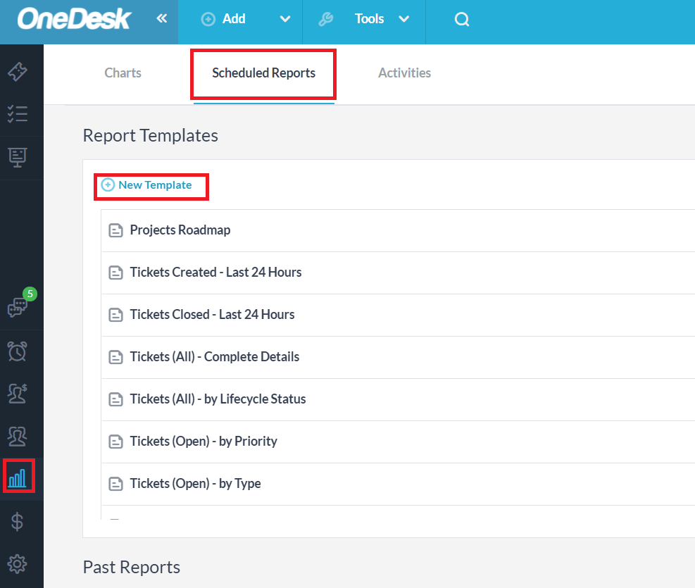
To create your own report you will need to choose that option from OneDesk’s reports section, which is a subsection of the analytics application. Select “more applications” on the bottom-left side of the OneDesk interface and the ‘Analytics’ application from there. Near the top of the screen you will see three tabs. Select the ‘Scheduled Reports’ tab to see the various report templates which exist already, your past reports which have been run, and the “+” icon to create a new report Template.
Creating a report example 1a: Report on hours worked by users
Let’s create a scheduled report that runs every Monday and sends one email to a company’s payroll employee stating the hours each consultant (user) has worked the previous week.
Let’s also do another report to go along with the first one, which will send an email to each customer with billing information for the previous week.
To start, select the new template “+”. The first screen that appears is the option to either create a custom report or to choose from a list of existing presets.
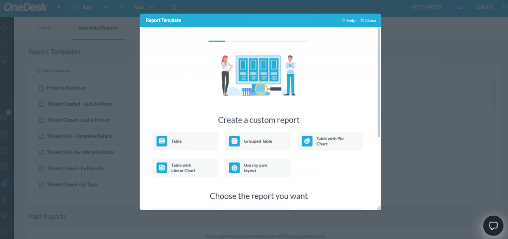
Since we want to first review hours worked by a team of consultants, let’s choose the grouped table option, and then on the next screen select the report to run on the submitted timesheets.
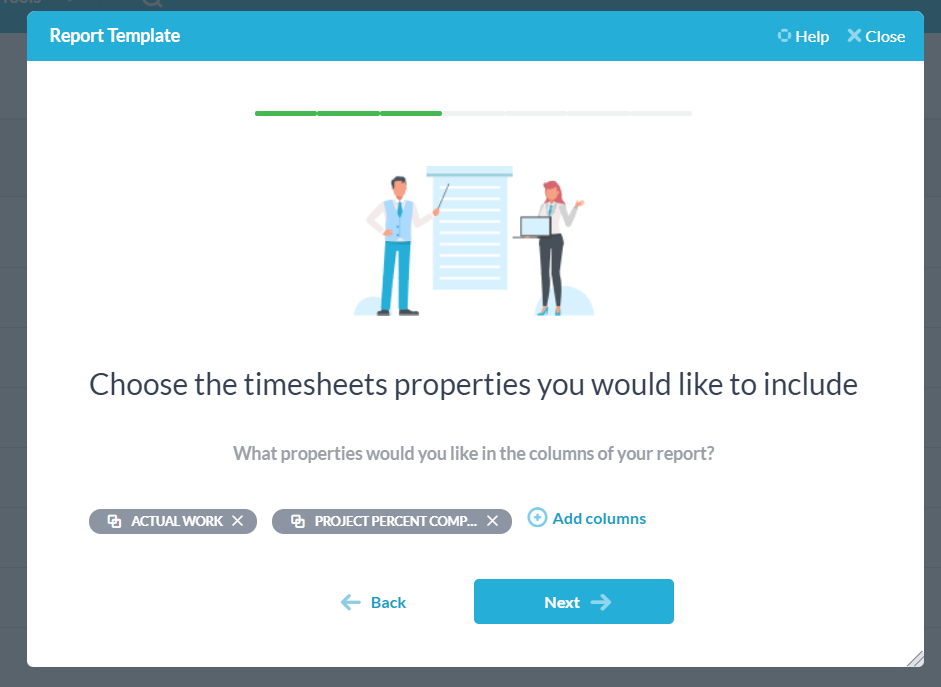
After this, we choose the properties we wish to include in the report. These properties make up the columns of your report, so we want to have a column for the actual work put into the specific project. Let’s also include a column for project percentage complete so we can get an idea of how many more hours need to be allocated to each project.
On the next screen there is an option to further filter the report down to a specific project, and then filter to specific properties within the project. We don’t need these for this report, so we will just move on.
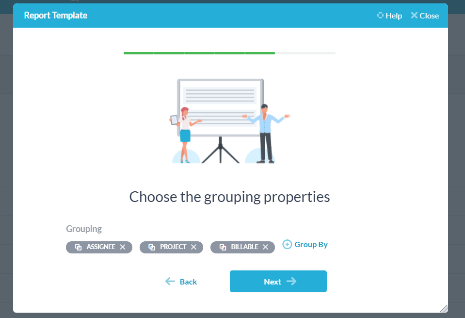
The grouping properties screen is where we can specify how our grouped table is presented. We will group our table by the project’s assignees, the project name, and then the billable status of each project.
Now we are almost done. We wish this report to run every week on Monday and to email the employee in charge of payroll at our company, so on the resulting screen we set our date to the next Monday (eg. January 3, 2022), the frequency to weekly, and the time to run the report – we’ll use 9 AM as an example. Under the “send email to” option we have selected a user who will act as our payroll head, and finally we choose the format of the report – either an XLS file, or a PDF converted from an XLS file.
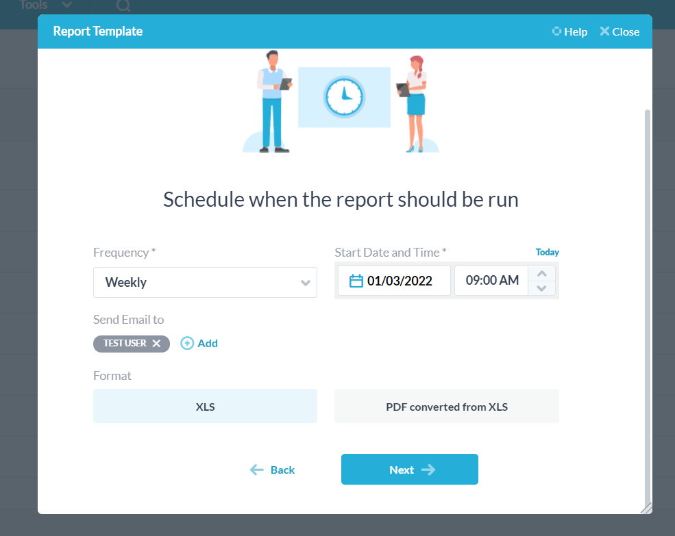
Select next, and now you can name your report, give it a description, and preview it in the format you selected. Once done, hit save and you’ve created your report. It will now be visible in the report templates section.
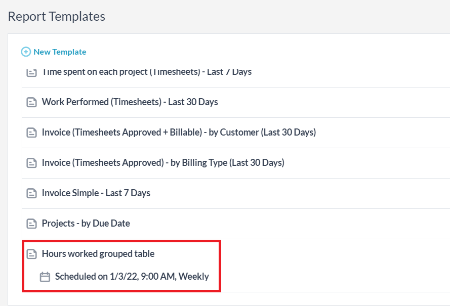
You can hover over this report and run it independently of its schedule if you wish, re-schedule or edit the report further, and delete the template if needed.
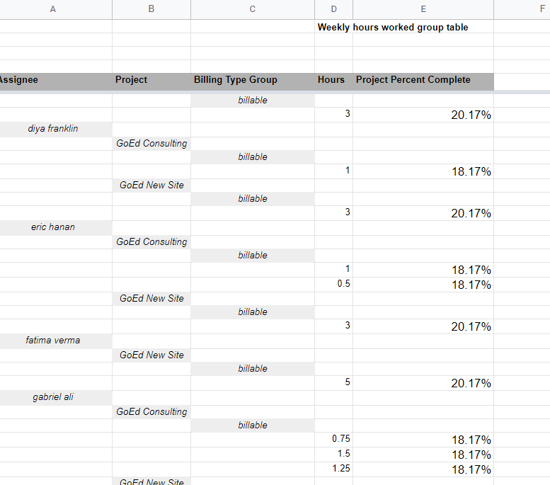
Once ran as an XLS file, your final report will look something like this:
Creating a report example 1b: Report on hours worked to customer
Now that we have created a report to show hours worked to a company’s payroll head, let’s create a report which shows customers the hours worked on their submitted projects and the billable type.
Following the same steps as before, we create a grouped table which runs on timesheets. For properties, we again choose actual work and project percentage complete.
Now for groupings, though, we don’t need to tell the customer who is working on their item, so we just group by project and billable type.
We want the report to run weekly on Mondays again, so we set that up, but we now change the notification email to send to our customer:
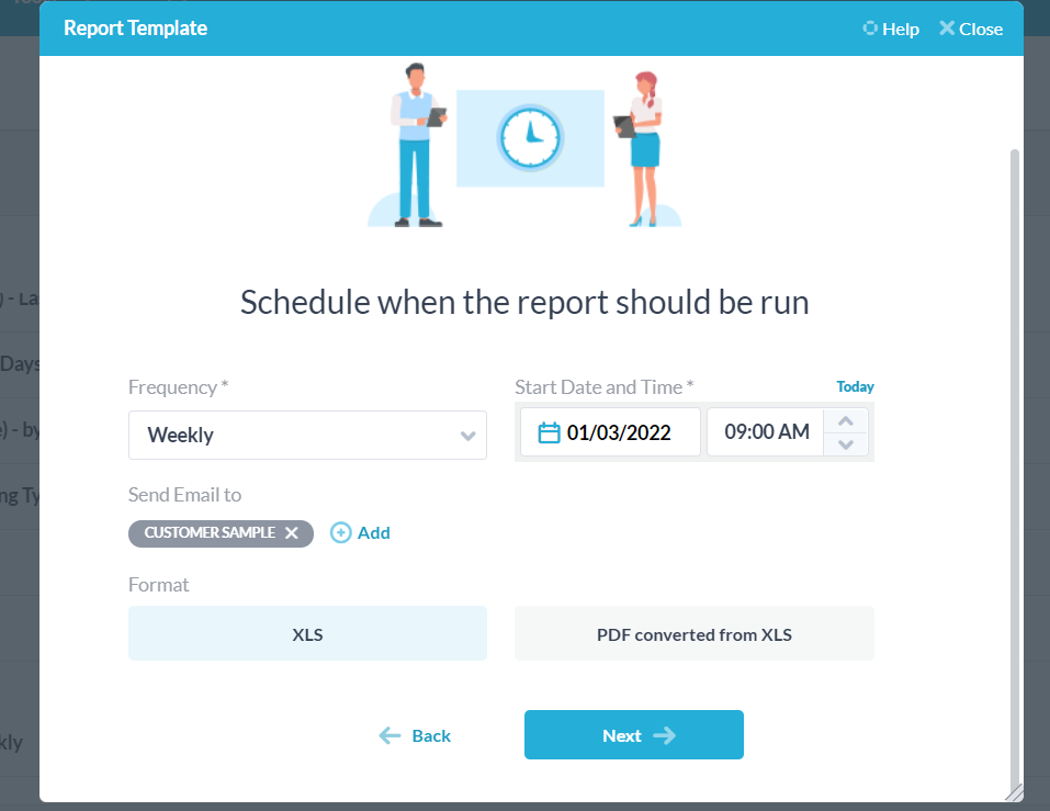
Completing that, we again select next, name our report, and we are done. Our final report will look like this:
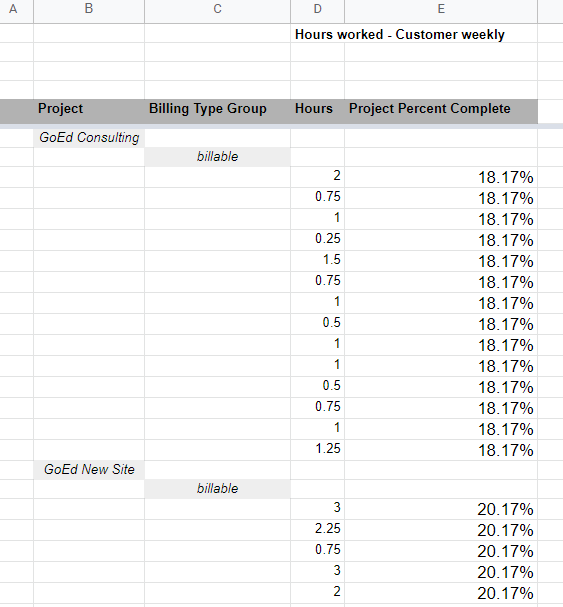
We now have two scheduled reports which run weekly on Mondays at 9 AM. The first will report on a project’s submitted timesheets by user to a payroll user, while the second will report on a project’s submitted timesheets to the customer whose tickets and tasks are contained within the chosen project.
Creating a report example 2: Monthly report of all new tickets + hours spent on each
For this example, we want to run a report once a month that will break down all the tickets which have been created in the previous month, and how many hours of work have gone into each of these tickets.
Let’s present our data in table format, and run the report on the tickets application. The properties we would like to include are the ticket names, what project they belong to, the actual work, and the ticket creation date.
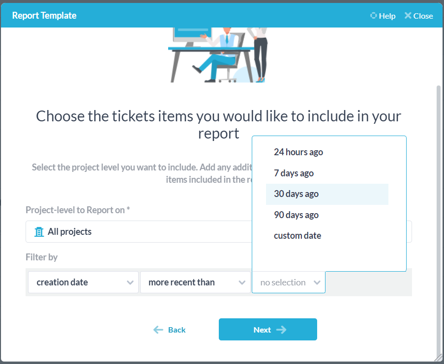
On the next screen we again can choose the project that our report runs on, and then add filters. Since we want to see all tickets created in the last month, we add a filter such that only tickets created within the past 30 days are reported on.
Finally, we choose when to run our report. Since we want to run it once a month, we will set the frequency as monthly, and have it run on the first day of the next month at 9 AM.
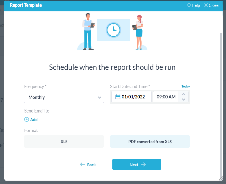
Select your format, give the report a name and description and save it – now you have created a monthly report on tickets created in the past 30 days, plus the work that has gone into them in that timeframe.
When ran, the report will look something like this:
