
The charts tab within the Analytics application allows you to analyze the efficiency of your customer support, and overall performance of your team and project management.
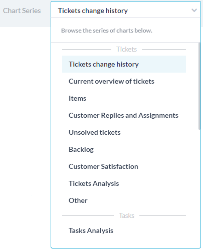
The chart tab consists of a collection of Chart Series, thematic groupings of your data. For example, the Tickets change history series shows charts for the resolution time of tickets, the average age of tickets, and more.
The Date Range filters data by a selected time period. You can choose from the selected date ranges or select your own by clicking on the desired start date and dragging the blue to the end date.
How to Create Your Custom Dashboard
For your most used charts you can create one or more custom dashboards. You can create filters for your data and select charts which will be saved as a view on the left panel. The date range can be selected in your views without the need to modify your view.
Step 1: Click on the My Views icon

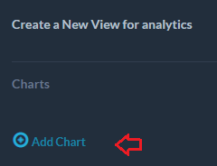
Step 2: Select Add Chart
Step 3: Available chart series appear on the left with corresponding charts on the right.
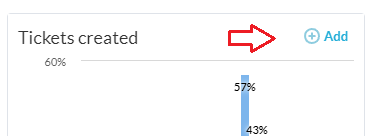
Next to any of the charts you want on your dashboard, click Add. You can select any charts you want regardless of the series it is in. Select Remove if you change your mind.
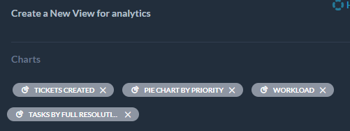
Step 4: Click Done when you’ve selected the desired charts. You will see your selected charts within the grey bubbles.
Step 5: Optionally, you can narrow the chart data with one or more filters, by selecting Add Filter. Filters limit your data based upon certain conditions. For example, if you select Assignee > is > [me] the view will only give you charts that align with this criteria.
Step 6: When satisfied with your selections click Save.
Step 7: Name your new dashboard view. Select Share this view if you want to share the dashboard with other members of your team. When finished, click Save.
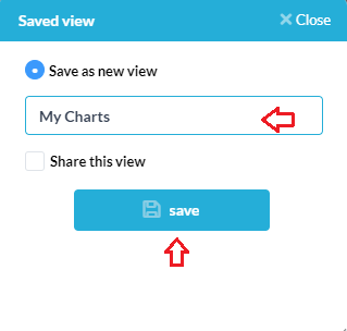
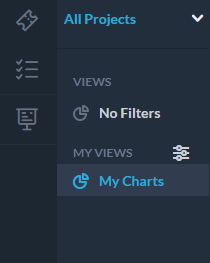
Your view will now be saved on the left side under My Views. You may create multiple dashboards views.
You may easily change the date range of your data without changing the your saved view settings
Project level selectors also can be applied to your dashboard without changing your saved view.
Example
Let’s create an example dashboard view. Let’s say you want to analyze how your support team is performing this month on their tickets.
We will add two charts to our dashboard view. First, select the series: Tickets change history. Add the chart called Tickets created/solved.
Go to the series: Unsolved tickets. Add another chart, let’s select the charted named Unsolved tickets by priority.
Next we will add a filter: Assignee team -> is -> Customer Support. Save your view and now select the date range of Last 30 days.